Tarina Tarantino advert analysis:
This media text is of the print institution, which is what this designer, Tarina Tarantino, heavily relies on as her target audience are women that would regularly read monthly fashion magazines. The target audience of Tarina Tarantino’s products are young girls and women mainly between the ages of 15 – 30, there is a wide age range is because of the fact that the designer has many different collections, some of which are targeted at specific ages.
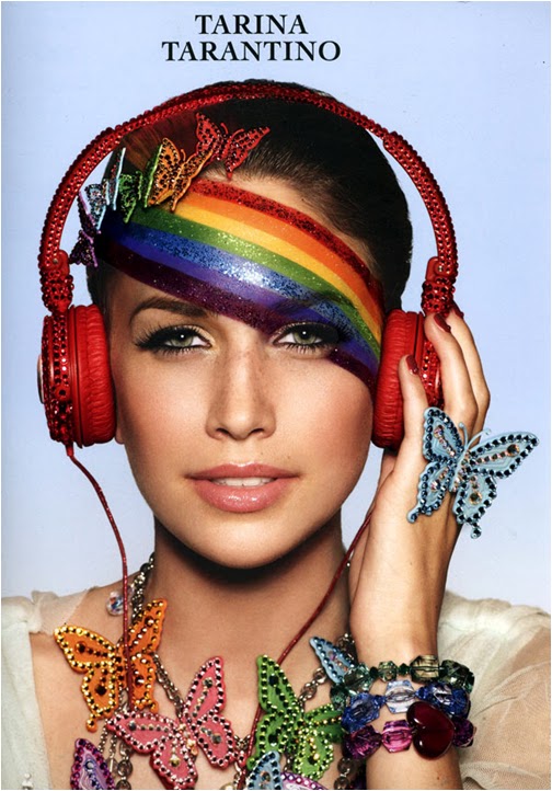
The background of the advertisement is blue which connotes the sky to emphasise on the rainbow coloured jewellery. This signifies tranquillity and serenity. The designer’s name is at the top and aligned to the centre of the advert which connotes the importance of the designer being the centre of attention and the most important person to acknowledge in this advert. In this advert everything is associated with nature which is attracting a new audience (animal lovers, hippies etc.) as the designer is known for her punk/outlandish designs.
The headphones on the model are in the colour red signifying the love (of music) and the model also appears to be listening to the headphones. This is another way of identifying the target audience of this particular product as being passionate music lovers. The jewellery itself is colourful and quirky contrasting with the peaceful sky background. This represents the target audience as females who are fun, youthful and fashionable. In this advert of Tarina Tarantino’s jewellery the model is wearing a nude colour top which fades in to the background showing the fact that the top is not the focus of the advert. This also adds onto the ‘au naturel’ theme of the jewellery collection. The image is a medium shot showcasing the new jewellery mainly focussing on the model’s accessories. The denotations of this are to promote the products however the connotations are subtle power as the products grab attention (even though the models pose is not commanding). The models bracelets are shaped like rocks in darker colours which further compliments this whole ‘au naturel’ feeling we get from this advertisement.
The lighting of the advert is natural focussing on the ‘au naturel’ theme of this advertisement; the make up of the model is quite natural (apart from the rainbow across her forehead). The angle of the shot is at eye level with the model and the audience as if the model were standing in front of them casually making a bold statement. The rainbow going across the model’s forehead complementing the jewellery’s quirkiness (which is a trademark for Tarina Tarantino). In my opinion there is some form of a stereotype of the model as a modern hippy with the rainbow across her face and the butterfly necklace which adds to the peculiarity.
The composition of the advertisement is made up of the model, the main subject, the jewellery and the accessories. The fact that the image only consists of one subject reflects the designers’ attitude as being unique and incomparable to anything thing else just like the subject of the advert cannot be comparable to any other person, as there is no one else to compare her to.